NDP18: We Are Singapore.
OFFICIAL RATIONALE:
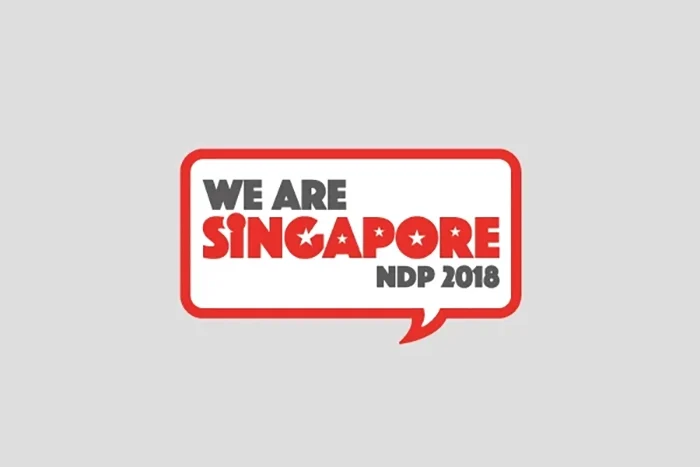
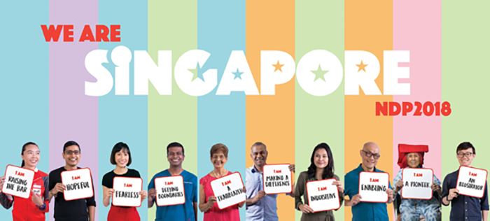
Aligned with the theme, the logo ties together the idea of the individual, and of many individuals uniting together and proclaiming that “We Are Singapore”. The logo is a typographic design of the theme itself:
“I” and the Crescent.
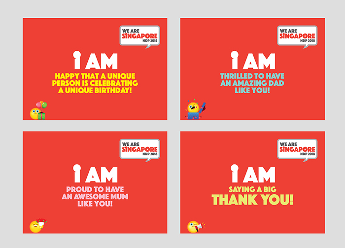
The “I” represents the importance of individual aspirations and actions in shaping Singapore’s future. The Crescent sits atop the “I”, symbolising a young nation on the ascendant and representing the aspirations of individuals who have allowed Singapore to rise. We must each see Singapore’s future as our individual responsibility, and it will be the aspirations of our youth that will ensure Singapore continues to rise.
Singapore and Our Flag.
The “I” forms part of “Singapore”, without which there could not be a Singapore. This part of the logo is a tribute to the Nation as our home, where “I” belong. It is specially designed to house all the elements of our National Flag and reminds us to hold fast to the values that have made us successful, represented by the five stars and a crescent in a familiar red and white.
A Collective Voice.
“We Are Singapore” sits within a bold speech bubble, symbolising our strength as a people when we come together – resilient with many voices uniting as one. It is our collective commitment to our country and its future.
[Read: The making of NDP18 logo]
TITLE
We Are Singapore
PROJECT
Official Creative Agency for NDP 2018
CLIENT
NDP 2018 EXCO / MINDEF
YEAR
2018
SCOPE
• Logo design
• Brand guide
• Corporate stationery
• Tickets
• Print ads
• Bus stop panels
• Bus wraps
• MRT walls
• Street banners
• Street decorations
• Digital/web assets
• Social media assets
• Floating Platform thematic skinning
• Media launch stage backdrop
• Fun packs design layout
• Souvenir booklet
• Commemorative book


